Thursday, 26 April 2012

Final Versions

These are my final products after all of the corrections and improvments have been made.

Cover Page


Contents Page


Double Page Spread


Monday, 23 April 2012

Evaluation - Question 7

Looking back at your preliminary task, what do you feel you have learnt in the progression from it to the full product?

I have created a prezi below. Within the Prezi I have explained what I have learnt in the progression to the main task from the prelim task.

This is the link to the prezi:

http://prezi.com/r-yhei8t1tz_/evaluation-question-7/

Evaluation - Question 6

What have you learnt about technologies from the process of constructing this product?


Before the preliminary task I had basic understanding of Photoshop and Illustrator in order to produce media products. During this time, I was also gaining some knowledge in photography and how to take photos at a professional level. My lack of photography knowledge can be seen in the lack of studio shots from the preliminary task. However, at the start of the main task I had a much stronger knowledge of InDesign, Photoshop and Illustrator. My skills in photography had also rapidly grown in the lead up to the Main task. At the start of this task, I had a stronger knowledge and was able to produce a much stronger finished product. 


Through looking over my preliminary task and with the help of my fellow pupils, I feel that I have got a much stronger understanding of Indesign. InDesign was used to create the layout of the magazine. After the completion of the main task, I now feel able and comfortable in creating a realistic and professional media product. From the previous preliminary task and from GCSE media, I had a basic knowledge of Illustrator. Now that I have spent some more time practising with the program, once again, I feel that I am now comfortable in creating graphics and text at a professional standard. 


My photography for this task was a lot stronger, which is shown throughout the cover, contents and double page spread. The use of the studio allowed me to manipulate the image easier in photoshop. I feel that photography itself made the product a lot stronger. An example would be the use of depth of field on the double page spread. This made the photo more intriguing and was a lot more attractive to the target audience. 


From GCSE media, I had quite a lot of knowledge of Photoshop. However, there was one aspect that I found difficult. This was changing the colour of someone's clothes, while also making sure that it looked realistic. This is why I looked on Youtube, asked teachers and fellow pupils, their way of doing this. From their knowledge, I was able to increase mine and pick the method that I felt produced the best product. An example of changing the colour, is on the contents page, I have changed the colours of someone's shirt to green. Below I have created a video showing the method that I have learnt in manipulating the picture: 


If the video does no work this is the link :

http://www.youtube.com/watch?v=9Em2xbbADwQ

Evaluation - Question 5

How did you attract/address your audience?


I have created a Wordle for each section, to show the words that the audience used to describe the work, when asked.


I asked several fellow pupils to describe in one word, what they thought made the contents, contents and double page spread, attractive to the audience. To show the words used to describe the project, I have created a wordle which shows the words, below. The larger the word is, the more it was used to describe the project.


Gaze theory


In order to attract the audience, I used a model in the key image that would represent, reflect and relate to the target audience. The model that has been used, is a male in his late teens, which is the same age as the target audience. When I asked the audience what attracted them to the magazine through gaze theory, they described the model as being attractive and this would be the reason they would purchase the magazine. This is one factor that reflects gaze theory. The model is wearing iconic clothing to the hip/hop genre, which will be similar to the clothing worn by the target audience, that are fans of hip/hop. By wearing similar clothing as the target audience, it reflects the audience, which addresses the audience and attracts them to pick the magazine up. The short hair that the model has, also reflects the hip/hop genre and so the audience. All of this allows me to take advantage of gaze theory. All of the female audience will be attracted to the model and aspire to be with someone like him. The male audience will look at the model and they will aspire to be someone like him. The Wordle above is a collection of words the audience gave when asked what shows gaze theory throughout the magazine.


Typographic Font


This Wordle shows a collection of the words the audience gave, when I asked them what it was about the font style that reflected the hip/hop genre and attract/address the audience. In order to address the audience, the font must also address the genre. The font style that has been used, is consistent throughout the magazine, this means that it is following the house style. The colours used for the tex and everything else, reflects the house style. This makes each page look neat and connected. The font reflects the stereotype of hip/hop rappers, as it's bold and it is a stereotype, that rappers are bold, strong characters. The boldness and thickness of the font is a great reflection of the hip/hop atmosphere, fans and audience. I feel that the font is a perfect reflection of the genre, which in turn is a perfect reflection of the target audience. 


Language/ writing style    


I asked the audience why the  language and writing style attracted and addressed the them and how it reflected the hip/hop genre.  I have now created a Wordle to show the words the audience described. There is colloquial language used  throughout the entire magazine. By not using formal text or literal text the language used, is closer to that used by the target audience. The use of colloquial language, means that the language is relatable to the target audience. It also means that it is easier for them to read particular articles. With the language being more understandable to the target audience, it makes the magazine more attractive to the audience. Colloquial language addresses my target audience directly. The interview also includes foul language, such as that used by the target social group. By including this type of language, it addresses the audience even more directly and makes the magazine more attractive to the audience.

Evaluation - Question 4

Who would be the audience for your media product?

In order to answer this question, I have created a video, where I have asked my fellow pupil who they think the audience for the media product would be. The questions that I asked were 'Who would be the audience for my magazine? and why do you think that?' 

Below are the videos:


Part 1:


Part 2:


Sunday, 22 April 2012

Evaluation - Question 3

What kind of media institution might distribute your media product and why?


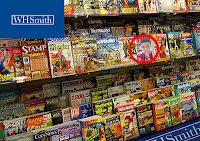
The most common institution for the music magazine to be distributed in, is a newsagents. The reason for this is because a newsagents distributes newspapers, gossip magazines, music magazines etc. everyday. As my product is a music magazine, it would be appropriate for a newsagents distribute it. I have used Photoshop above, to demonstrate the use of my magazine in the newsagents, to show how suitable and appropriate the magazine is, to be distributed by a newsagents. 


Similarly to a newsagents, a company that would distribute the magazine, would be WHSmith, as again it sells magazines on a regular basis and is a trusted company, therefore the audience would be more likely to purchase the magazines. As the product is a magazine, it means that it would be advisory to have it distributed in a well established, trusted and popular shop,  WHSmith is a one of these shops.  Again, I have used Photoshop to demonstrate my point. 


I have also looked at several media distributing companies. One that has caught my attention is 'IPC|MEDIA.' To the left, I have used Photoshop to put the IPC|MEDIA logo onto my final cover page. 


The reasons that I believe IPC|MEDIA would be a good distributer, is because they produce over 60 iconic media brands, which means that they reach a very wide audience. It is also because it is the UK's leading consumer magazine company. The company says that IPC's diverse print and digital portfolio offers something for everyone. However, they do not have any magazines of a hip/hop genre. For this reason, I believe that my magazine would be a great addition to the company. My magazine would widen the audience further and increase their profit. 


The company state they have a 'focus on three core audiences: men, mass market women and upmarket women.' My target audience falls between men and mass market women. The magazine also widens this audience slightly, giving the company a larger profit. As the company has no hip/hop magazine, instead they have punk rock and pop magazines. It means that my magazine will not have have to compete with any other top selling magazines because they are not of the same genre. Another reason that I have chosen IPC|MEDIA to distribute my magazine, is because if has partnerships with lots of large supermarkets. By having my magazine in large supermarkets, it means that a wide audience will be able to purchase the magazine, a wider audience than the magazine would get from newsagents alone.     


Link to useful IPC|MEDIA sections - http://www.ipcmedia.com/
                                                     http://www.ipcmedia.com/about/                                                                
                                                     http://www.ipcmedia.com/about/advertising/

I also wanted to look at distributors that do have hip/hop magazines and are popular. For this reason, I looked at 'XXL,' a very popular hip/hop magazine and I looked into what the distributor the magazine uses. This magazine is one of the most popular hip/hop magazines around the world and one that I researched in order to create the design for my project.


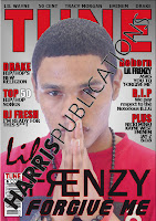
I found that the distributor for XXL was Harris Publications. To the right, I have used Photoshop to show my cover being owned by Harris Publications. 


The reason that I believe Harris Publications would also be a good distributor is because they publish over 75 titles, all of the world. It publishes a wide variety of magazines, which means that the audience is very vast. The main reason that I have chosen this distributor, is because they publish XXL, which has the same target audience as my magazine. At this moment, it is the only music magazine being published by Harris Publications. For this reason, the audience will see a new magazine and be more interested in purchasing it.


Link to Harris publications - http://www.harris-pub.com/
                                        http://en.wikipedia.org/wiki/Harris_Publications#Music   

Evaluation - Question 2

How does your media product represent particular social groups?

In order to answer this question, a Prezi has been created, where the aspects of the magazine that represent particular social groups have been highlighted.


Below is a link to the Prezi:

http://prezi.com/cajwprhfkphc/evaluation-question-2/


Friday, 20 April 2012

Evaluation - Question 1 - Cover Page

In what ways does your media product use, develop or challenge forms and conventions of real media products?


I have annotated the codes and conventions of the existing cover page, so that it is clear what needs to be seen on the final cover. I have then annotated the final cover, showing what codes and conventions the cover used, developed and challenged.


Existing Cover:


Final Cover:


Evaluation - Question 1 - Contents Page


I have annotated the codes and conventions of the existing contents page, so that it is clear what needs to be seen on the final contents page. I have then annotated the final contents page, showing what codes and conventions the cover used, developed and challenged.


Common Contents Page:

This is what a common hip/hop contents page looks like. This is a common layout adopted by many hip/hop magazines. It is a code and convention to have only one key image, that takes up the majority of the page. However, this means that there is not a variety of images. In order to create a successful contents page, the contents page that is going to be created, has to include a variety of images. This is the reason that further research was carried out into hip/hop related contents pages, as a variety of images sometimes means that the page will look more attractive to the audience. 

Apart from the key image, the codes and conventions of this contents page are the same as the contents page below. These conventions include a large, bold masthead. Bold headings and page numbers and the logo of the magazine have been put on the page, slightly altered into a faded letter but still a convention followed on the page. 


Existing Contents:


Final Contents:


Evaluation - Question 1 - Double page spread


I have annotated the codes and conventions of the existing double page spreads, so that it is clear what needs to be seen on the final double page spread. I have then annotated the final double page spread, showing what codes and conventions the cover has used, developed and challenged.


These are the third annotated images for double page spreads:


Thursday, 19 April 2012

Final Versions

Cover Page
  
Contents Page

Double Page Spread

Draft Versions - Double Page Spread

This is my first draft version of my double page spread. I have asked several of my fellow pupils to comment on my work, so that I can improve and alter my work.

Draft 1


Number 1
The key image on this page is very good. I like the model is looking straight at the audience, it incourages me as the audience to read the interview. I think that the quote is very strong, I like how 'YOU' is underlined to enforce that the artist is talking directly to the audience. I think that the quote could be larger and wrapped around the image, this would mean that the quote was more eye-catching and clearer to the audience. 'Lil Frenzy' stands out well with the rest of the copy. It is clear and matches the type of font that was used on the cover page. I think that the introduction at the top of the page, is clear and easy to read. I think that it works well to incourage the audience to read the rest of the interview. I like how the title goes down the side of the page and runs the full length of the page. It is very eye-catching and would be intriguing to the audience.

Number 2
I like how the masthead of the interview runs down the full length of the page. It makes the page attractive and intriguing to the audience as it stands out to the audience. I think that it could be slightly thicker so that it stands out more to the audience. The copy is clear and I think that the overall layout looks proffestional. I like the key image that has been used. I like how he is looking at the audience. The stern face that he has works well as it indicates that the magazine is hip/hop well. The quote next to the key image is clear, I think that it could be larger just so that it stands out more to the audience.

Number 3
The introduction at the beginning of the interview looks really clear and works well to incourage the audience into reading the rest of the interview. The masthead is attractive and works well to intrigue the audience into reading the interview. The key image is good as I feel it uses gaze theory and meets the convention of hip/hop magazines. The way that the model is looking straight towards the audience is intriguing. I like how he intrigues the audience by having the model looking at the audience, but also how he is pointing straight at the audience. I think the use of depth-of-field works well to make the image more attractive. I think that the masthead could be made thicker to stand out. I also think the quote should be larger so that it is more eye-catching.

What I intend to do
After evaluating the comments made by my fellow pupils, there are some changes and alterations that need to be made to improve the double page spread. I must make the quote next to the key image larger so that it stands out more to the audience and is more eye-cathcing. The same must be done for the masthead going down the side of the page. I will make larger, bolder or thicker so that it stands out more to the audience.

Draft Versions - Contents Page

This is my first draft for my contents page. I have asked several of my fellow pupils to comment on the page.  From their comments, I will know what to improve or alter on the contents page.

Draft 1


Number 1
The layout of the contents page is attractive and well presented. I think that the layout is very clear and is easy to follow for the audience. I like how the key image clearly tells the audience that it is the most important story. The key image also has a sense of intimidation, which I feel works well with the genre of the magazine. The images that have been used are good however, I think that the the first image and the last image are very similar. Although a different location is used, it is still a mid shot of a model. I think that a different image should be used, if a close up or two shot is avalible then that should be used. I like how the main stories under the 'Features' stand out due to the red text. I think that the colours that have been used work well as they contrast with eachother to stand out to the audience, and are the same as those used on the cover page.

Number 2
I like the images that have been used. I think that they work well to make the page attractive and vibrant. Some of the images are quite similar, I think that one of the images needs to be changed just to show a complete variety in images. Some more copy needs to be added to the information of the pages, to give the audience more information and encourage them to go to the pages. The copy under the 'Plus' need to be put inline with the key images borders and the black block underneath that. This would make the page look neat and proffestional, having all of the copy in line would make it look professtional. I really like the key image that has been used. It makes it clear to the audience what the main story of the magazine is. I like how the headings that are red tells the audience what the secondary important stories in the magazine are.

Number 3
I like the way that the copy for the important stories are in red. I do think that all of the headings should be made bold, so that they stand out to the audience and is clear that they are seperate from the informatoin. The borders around the images work well to seperate them from the copy around them. I think that the last image is to similar to the image at the top. The location is different which works well but the mid shot makes it the same. I think that the colour that have been used work well to make the copy stand out to the audience. Some of the copy needs to be moved around to put it in line with the key image and other images. By having the copy in line and neat, it makes the page and copy clear and look proffestional.

What changes I intend to do
After evaluating the comments made by the my fellow pupils, there are several alterations that need to be made in order to improve my contents page. These improvments include, making the headings bold so that they stand out to the audience and seperates the headings from the rest of the copy. I need to change the image at the bottom of the page, as it is to similar to the other images. I am going to swap it with a two shot I have taken, this will mean that a variety of images are being used. The copy will need to be justified so that it is in line with the key image, this will the page neat and the copy clear, easy to read and attractive. I will add some more copy into the information so that the page looks more appealing as there is no dead space.

Wednesday, 18 April 2012

Draft Versions - Cover Page

This is my first draft version of my cover page. I asked several of my fellow pupils to comment on the cover and suggest what I could do to improve it. 


Draft 1


Number 1
The white background is quite bland, it works well in terms of making the text stand out. However, it is not very attractive, adding some colour would make the cover more vibrant. I really like the image that has been used. The model is looking straight at the reader, which engages the reader to pick the magazine up. The text behind the model is ok but I think that it should be brought to the front. I also think that the the 'lil Frenzy' and the 'Forgive Me' should be in a different font, in its current form, it does not pull me in. I do like how the 'R' is the other way round, which is something that I have seen used by some rappers. Overall, I think that the layout of the magazine is very good and close to professional. I think that with a few adjustments, the cover would be even closer to a hip/hop magazine. 

Number 2
I like the overall layout of the cover page. I like how the key image is looking straight towards the audience, which draws the audience in. The masthead is eye-catching to the audience and works well as a hip/hop masthead. The lures around the edge of the key image would look better in front of the model, the lures are slightly hard to read behind the model. The 'lil Frenzy' and 'Forgive me' is quite dull and does not encourage the audience to read the magazine. I think that the white background should also change, as it is boring and will discourage the audience from picking the magazine up. A glow or shadow would make the background more attractive or intriguing to the audience. 

Number 3
I think that the overall layout of the magazine is close to a hip/hop magazine and matches many of the codes and conventions. I think that the lures should be in front of the key image and the headings could be slightly larger, to make them stand out more to the audience. I think that the dead space above the headings, could be replaced with more lures, or the lures could be moved up and enlarged. I like how the key image is looking towards the audience, I think that this encourages the audience to pick the magazine up and read it. The artists name could be a different font, I feel that it is quite dull and would be more attractive if the font changed. Overall, I like the layout and if the changes were made, the cover would be very attractive and would be an effective hip/hop cover page. 

What changes I intend to do  
After evaluating each of the comments, I have decided that there are several alterations that need to be made in order to create a better and more effective cover. The name of the existing artist above the masthead needs to be changed to be the same font style as the style of the lures. The white background needs to be altered. At the moment, it is dull and not very intriguing for the audience. I will add a shadow or glow to the background, to make it more attractive to the audience. The lures are going to be be moved up, to replace the dead space. The headings and lures will be made larger, so that they are easier for the audience to read and see. The 'Lil Frenzy' and 'Forgive me' should be changed to make them more vibrant or intriguing to the audience. They need to be more attractive, to encourage the audience to pick the magazine up in the first place. The key image is slightly overexposed, in Photoshop, I will darken it,  to make it less overwhelming for the audience.  

Tuesday, 17 April 2012

Chosen Photography

These are the photos that I have chosen to include in my project. I have created a prezi to show and explain why the images have been chosen:

http://prezi.com/swvfeqp4fe96/chosen-photography/

Orginal Photography

I have created a prezi that shows my orginal photography. The prezi shows my shots for my cover, contents and double page spread:

 http://prezi.com/wn7quld9ddl7/main-task-orginal-photography/

Designs - Chosen Designs

These are my chosen designs for my cover page, contents page and double page spread. I have chosen these designs, as I feel that they are the most effective, as they resemble hip/hop genre the best. The designs meet the codes and conventions followed by existing hip/hop magazines. Now that I have chosen my design, I will start the photography stage, I will take lots of shots, so that I have several to choose from.

Cover Design


This is the chosen design for the layout of the cover page. The design was created by following the codes and conventions of hip/hop magazines. The masthead is bold, large and vibrant in order to catch the audiences' eye and it follows the strict code and convention of hip/hop mastheads. The key image takes up the majority of the page and covers the masthead slitty. This is a common convention of many hip/hop magazines and is now relatable to hip/hop magazines. The lures on the beside the key image have been put behind the model, this was done to show a variety of designs. This is going to experimented with, lures behind and in front of the model will be looked at. I am going to experiment with hand gestures in my photography as they are used in several different ways throughout hip/hop magazines. The name of the artist is some of the largest font on the page, this follows the codes and conventions of hip/hop magazines. A close up has been chosen as the key image of the cover page as it makes the emotions more intense and the link between the magazine and the audience is stronger. The house style colours consist of white, red and black. By using few colours and using them throughout the magazine it follows the codes and conventions of hip/hop magazines, the colours also means that the magazine will not be to overwhelming and the colours will eventually be relatable to the magazine 'TUNE.'   


Contents Design


This is the chosen design for the contents page. A large, bold masthead is at the top of the page, taking up the width of the page, which follows the convention of many hip/hop magazines. Below the masthead a small black block is going across the width of the page. Within the block is the issue number, the release of the magazine and the name of the magazine. This makes these specific bits of information clear to the audience and it can also be used to split the masthead from the start of the images and copy. Which makes the page look neat and structured. The key image is the largest image on the page which relates to the most important story in the magazine. By making this image the largest, it is clear to the audience that it is the most important story. Part of the key image also covers the masthead, this follows the codes and convention of most hip/hop contents pages. This contents page contains more than one image. This is uncommon for many hip/hop magazines. The only examples I found were from the magazine 'Hip-Hop' and one from 'Vibe.' Other images have been incorporated in order to create a better standard contents page that is more attractive and effective to the audience. The colour scheme has been kept the same throughout the cover and contents pages, which makes the pages relatable and well structured. The headings and the page numbers are all bold, this is so that they stand out to the audience. The main stories heading and page numbers are the largest, which enforces the fact that it is the main story to the audience.


Double Page Spread Design


The design for the double page spread using two different designs in order to create the most effective double page spread. The key image takes up one whole side of the double page spread, which follows the codes and conventions of all hip/hip double page spreads. When taking photography I will get the model to point towards the audience as this makes the link between the model and the audience stronger. The colour scheme of red, black and white is on the double page spread, which means that the house style has been kept through out the magazine, this means the colours are relatable to the audience and shows a structure to the pages in the whole magazine. A quote from the artist is next to the key image feel dead space and can been seen being used in existing hip/hop magazines. The title of the story on the double page spread goes down to side of the page. This was to make the masthead more intriguing and attractive to the audience. The masthead is the artists name, however the name of the story is also going to be experimented with for the masthead. An introduction at the top of the page can be a lure of to encourage the audience to read the rest of the story. The interview has been split into two section so that more information can be put into the double page spread. The headings are going to be bold so that they stand out to the audience and makes the page look more neat.

Designs - Double Page Spread

These are my designs for a double page spread. These double page spreads are for a hip/hop related magazine. I have used my research of existing double page spreads to influence my designs. I have taken all of the points that improved the magazines and that made them more attractive to the target audience and used them in my designs. Below are my three designs for a double page spread:

Design 1

Design 2

Design 3

Designs - Contents Page

These are my designs for a contents page. The content pages are for a hip/hop magazine. I have used my research of existing contents pages to influence and drive my designs. I have taken the advantages of the magazines, that made them more effective and vibrant to the target audience and used them in my designs. Below are my three designs for a contents page:

Design 1


Design 2


Design 3

Designs - Cover page

These are my designs for a cover page. The cover page is for a hip/hop magazine. I have used my research of existing cover pages to influence my designs. I have taken the good points of the magazines, that made them more effective and attractive to the target audience and used them in my designs. Below are my three designs for a cover page:

Design 1


Design 2


Design 3

Monday, 16 April 2012

Further Research on Contents Pages

I decided that the contents pages that I have analysed, do not show a variety of images, which is one of the main aspects needed to reach to top marks. For this reason, I looked in more depth at hip/hop related magazines and found some that show several images on a page, instead of just one. Below I have shown the other contents pages.


Below are three examples of other hip/hop related contents pages:


Now that I have completed some more research into contents pages with more than one image, I will be including more than one image in my own work. From the research that I have completed, there are some aspects and components that are used. These include the main story having a key image that takes up the majority of the page and is the focal point of the page for the audience. The page numbers and headings are bold, so that they stand out to the audience. I am going to try and incorporate the black block into my work, as I feel that it splits the images and the text well and makes the page look neat. The masthead will be in a large, bold font, across the top of the page. The logo of the magazine can be included on the page; 
I will try this in my work, as I feel it works well with the overall layout of the page. 

Sunday, 4 March 2012

Research - Bands - Tinie Tempah

I will now analyse the website, album artwork and fashion of the hip/hop artist 'Tinie Tempah.' The reason for doing this, is to gain some knowledge on the codes and conventions that associate each artist with the hip/hop genre and helps the audience to be associate them. When I create my magazine, this analysis will be very useful, as I will be able to revert back and use the components that I highlighted, in order to improve my work and make it stronger. I have commented and highlighted other components that improve the website, album artwork and fashion, other than the codes and conventions, so that I can improve my work further. Now these evaluations have been completed, I feel that I have a much better understanding of the codes and conventions that are used to create an affective hip/hop related product, I will use these factors in my own magazine, to make it look stronger, more professional and be associated with the hip/hop genre to the best of my ability.

The third artist that I am going to investigate, is Tinie Tempah, a popular hip/hop artist:

Website:


Album Artwork:


Fashion :


From the research I have completed on Tinie Tempah, I have gained the information that I will use to create my draft for the magazine. I will take the aspect, components and knowledge of the codes and conventions of the hip/hop genre and apply them to my magazine. During my photography stage, I will keep what associated the aspects with the genre in mind. This includes having the model staring at the audience with a stern look on their face. It also includes having the models in black and white, so that I am following the convention of the hip/hop genre. Jewellery is needed, in order to follow the codes and convention of hip/hop fashion. I can also include shades, if it will improve the shot, in some cases the shades follow the conventions of the genre and are iconic to an artist.

Research - Bands - Lil Wayne

I will now analyse the website, album artwork and fashion of the hip/hop artist 'Lil Wayne.' The reason for doing so, is to gain some understanding and knowledge on the codes and conventions that associate each artist with the hip/hop genre. When I create my magazine, this analysis will be very useful, as I will be able to revert back and use the components that I highlighted, in order to improve my work and make it stronger. I have commented and highlighted other factors that improve the website, album artwork and fashion, other than the codes and conventions, so that I can improve my work further. Now these evaluations have been completed I feel that I have a much better understanding of the codes and conventions that are used to create an affective hip/hop related product, I will use these factors in my own magazine, to make it look stronger, more professional and be associated with the hip/hop genre to the best of my ability.

The second artist that I am going to investigate, is Lil Wayne, a popular hip/hop artist:

Website: 


Album Artwork:


Fashion:


From the research I have completed on Lil Wayne, I have gained the information that I will use to create my draft for the magazine. I will take the aspect, components and knowledge of the codes and conventions of the hip/hop genre and apply them to my magazine. During my photography stage, I will keep what associated the aspects with the genre in mind. This includes having the model staring at the audience with a stern look on their face. It also includes having the models in black and white, so that I am following the convention of the hip/hop genre. Jewellery is needed, in order to follow the codes and convention of hip/hop fashion.